Redesigning the Flight Booking Process
Research
The percentage of shoppers that abandon their travel purchase is 85% for desktop users and 91% on mobile devices
SalesCycle
Travellers visit 38 websites on average to finalise and book travel plans
Skift
45% of travellers prefer booking a trip from start to finish from a single website that presents options for flights, accommodations, car rentals and extras
Travelport
.png)
.png)
.png)
Through online surveys and competitive benchmarking, I was able to understand what competitors do well but more importantly what are the main pain points that occur during the user experience which stop the user from finalising the booking process


"Homepage was too busy with advertisement"
Usability test A
"I like to use, if they have the calendar like this... I like to scroll over instead of entering in"
Usability test B
From these insights, I was able to focus on specific aspects of the user experience: goals, behaviours, positive interactions, pain points and context.
Analysis
My group and I organised these insights and information from the usability test into distinct categories in an affinity diagram which displayed what needed problem-solving in each category.


In this structured format, the customer journey map pinpoints the fundamental pain points in each part of the user flow

Concept
Taking one user experience example, this user flow diagram links user preferences and behaviour with how I planned on angling software to my user-centric web design.

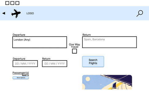
I designed this prototype using Figma. Annotations centring on efficient navigation which direct software developers on creating a more successful booking process


Through feedback from my group and software developers, I made several design changes creating a more productive medium-fidelity prototype
"they select their first stage and then they select your second date... on the same sort of calendar interaction"
"if I click here... the page jumps to the top... on Figma it's called preserved scroll position"
Eoghan from UXDI
Design
Using the feedback, I realised how I could redesign my prototype with a more efficient user flow. More symbols to direct through the booking process and colours that comprehend to the user what is selectable


